Rules to Better Interfaces (General Usability Practices)
Do you know the importance of testing your interface?
You won’t know if your interface is any good until it’s actually tested! Test, test, test, nothing can possibly replace that first hand data.
Do you test high-risk features with real users before launch?
Shipping a high-risk feature without testing it with users is a gamble. If your update affects sign-up flows, checkout processes, or dashboards, you can’t afford to guess. Usability issues that slip through can cost you revenue, reputation, and rework time.
Even experienced designers and developers miss things. The only way to validate an interface is to observe real users attempting real tasks.
Why test usability?
According to NN/g, usability testing helps you:
- Catch usability issues before they reach production
- Improve clarity in copy, layout, and task flow
- Understand user behavior, expectations, and intent
- Validate key design decisions with confidence
Even a small round of usability tests can surface critical blockers before they impact real users.
What features should always be tested?
Prioritize usability testing when a feature is:
- Critical to business outcomes (e.g. sign-up, checkout, dashboards)
- Expensive or time-consuming to change after release
- Related to onboarding or first-time experiences
- Brand new or involves complex flows
- Shared by multiple user roles or departments
When in doubt, test it. It’s always cheaper than fixing issues after the fact.
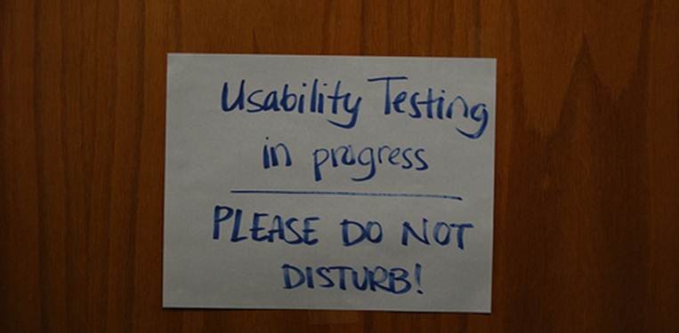
Video: Usability Testing 101 (2 min)How to run a quick usability test
Usability testing doesn’t require a lab or a research degree. Anyone on the team can run a simple test with these three elements:
Element What it is Facilitator A neutral observer. They give instructions, avoid leading, and prompt users to think aloud. Tasks Realistic scenarios such as: “Find the report for Q2 and download it.” Task phrasing matters. Don’t guide or prime. Participant A real or representative user. Ask them to narrate their actions and thoughts as they go. Tip from NN/g: 5 users is enough for a qualitative test. This reveals around 80–85% of the most common usability issues.
Remote or in-person?
Either works. Choose what suits your access to users:
- In-person – Office, lab, or meeting room
- Remote (moderated) – Over Zoom or Teams with screensharing
- Remote (unmoderated) – Use tools like Maze or UserTesting to capture session recordings
You don’t need fancy tools. Sometimes, all you need is a few users and a fresh perspective.
Example
You’ve redesigned the onboarding flow for your app. Before launch, you run usability tests with 5 new users. On screen 2, all participants misinterpret the CTA and hesitate. You tweak the language and spacing before release.
✅ Figure: Good example – You fixed a usability blocker before it impacted users
You launch a major dashboard redesign without testing. Support tickets flood in. Users are confused by ambiguous icon labels and can’t find the filters.
❌ Figure: Bad example – Avoidable UX issues caused friction and hurt trust
Bonus tip: Test before the code
You don’t have to wait for development. Early testing with wireframes or clickable prototypes can reveal the same usability issues at a fraction of the cost.
Try a 3-day usability sprint:
Day 1 – Write tasks and prep the prototype.
Day 2 – Test with 5 users.
Day 3 – Analyze findings and make improvements.
Do you realize that a good interface should not require instructions?
The corner stone of good user interface design is that if your users need instructions, you haven't done a good job. Of course with particularly complex applications there will be exceptions to this rule, but all developers should aim to make your interface as self-evident as possible.
- There are no surprises
- There is no need to use help
- No excuse for RTFM (read the freaking manual)

Figure: A good interface does not need instructions!
A good UI is:
- Intuitive
- Feels fast e.g. no white screen, threading code
- Consistent
- Minimal popups
- No clutter - not busy
- Good error handling
- Easy to customize + apps (aka a platform)
- Gamification e.g. badges
Suggested reading:
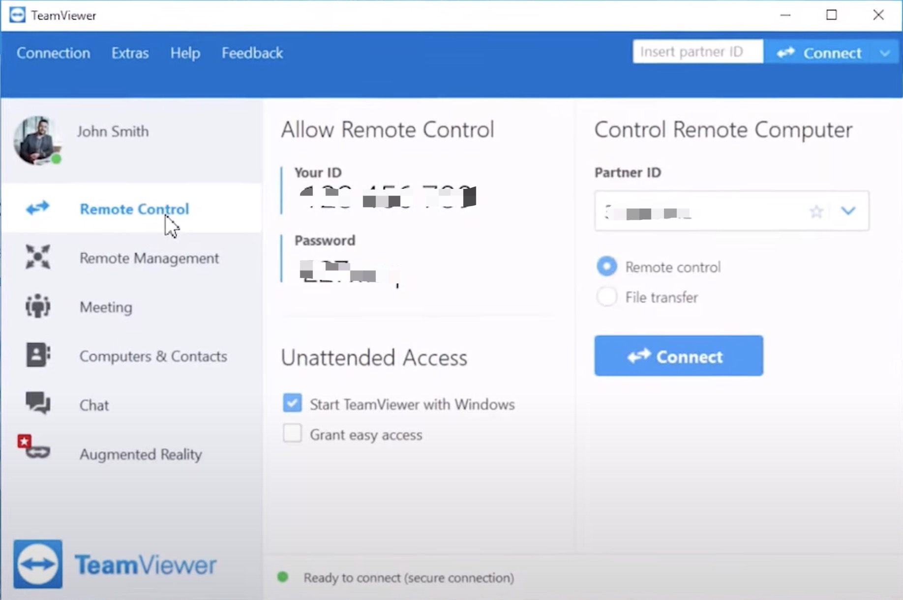
✅ Figure: Good example - Teamviewer's interface requires very little explanation

✅ Figure: Good example - See the fly? (an example of excellent usability) Dutch manufacturers realized that a fly painted on the urinal became a "target" for men using the facility. And the fly is positioned in precisely the right place for minimal spillage or splash back. Clever people those Dutch!
Do you make users intuitively know how to use something?
- When we see a door, we immediately know that we can open it and go through it
- Links in blue and underlined has an affordance of clickability
- Buttons can be pressed
- Scrollbar moves the document in the window

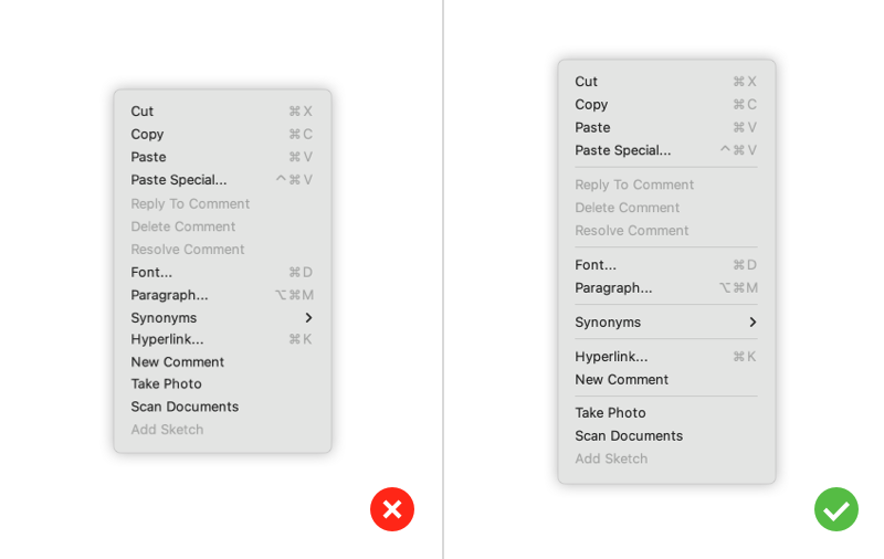
❌ Figure: Bad example - The affordance of the checkbox makes this UI misleading

❌ Figure: Bad example - If this mop sink didn't look so much like a urinal and wasn't right next to the toilet, maybe the sign wouldn't be necessary

❌ Figure: Bad example – It might not have been a good idea to place a male policeman where the exhaust pipe is

❌ Figure: Bad example - Old Microsoft Word - Because of the UI, people never knew they could use styles e.g. normal, H1, H2
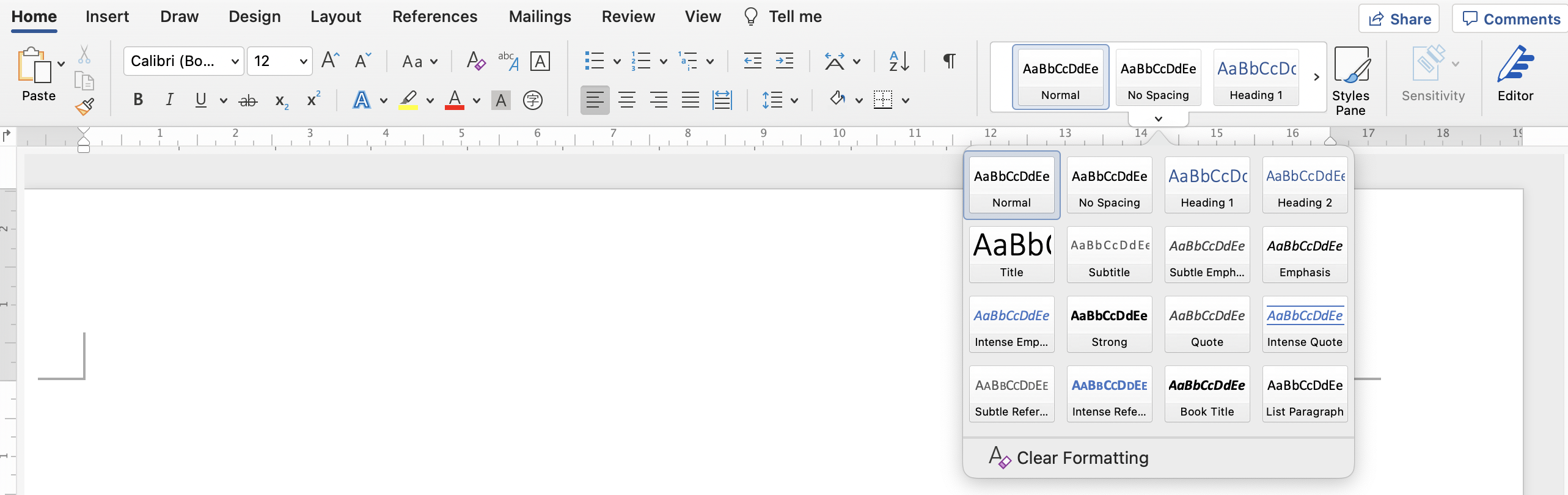
✅ Figure: Good example - New Microsoft Word - Because of the new ribbon UI, people intuitively know how to use styles

❌ Figure: Bad example - Which is the dial that controls the top-right stove?

✅ Figure: Good example - In this layout, it's easy to see which dial controls which stove
Do you always try to reduce complexity?
The human brain:
- Never searches for OR compares all options
- Prefers smaller sets of options (4 or less)
- Picks the first option that looks good enough
- Prefers a shorter option to a longer one
- Makes a compromise between speed and accuracy
It's important to keep these in mind when making design decisions or presenting data.
Our visual short term memory has a capacity of 4 items. So options are easier for our brain to digest when presented in sets of 4.
✅ Figure: Good Example - Blocks of 4 or less menu items are easier for the brain to consume
✅ Figure: Good Example - A great example of removing complexity
Do you avoid unnecessary labels?
Thinking about UI, the objective is to create clean interfaces by minimizing clutter. You do that by removing noise. One of the most common ways to avoid noise is the removal or de-emphasis of labels whenever possible.
❌ Figure: Bad example - Unnecessary labels
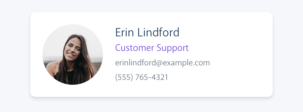
✅ Figure: Good example - Users can easily understand the information without the unnecessary labels
Find more examples and information on the article "Labels are a last resort".
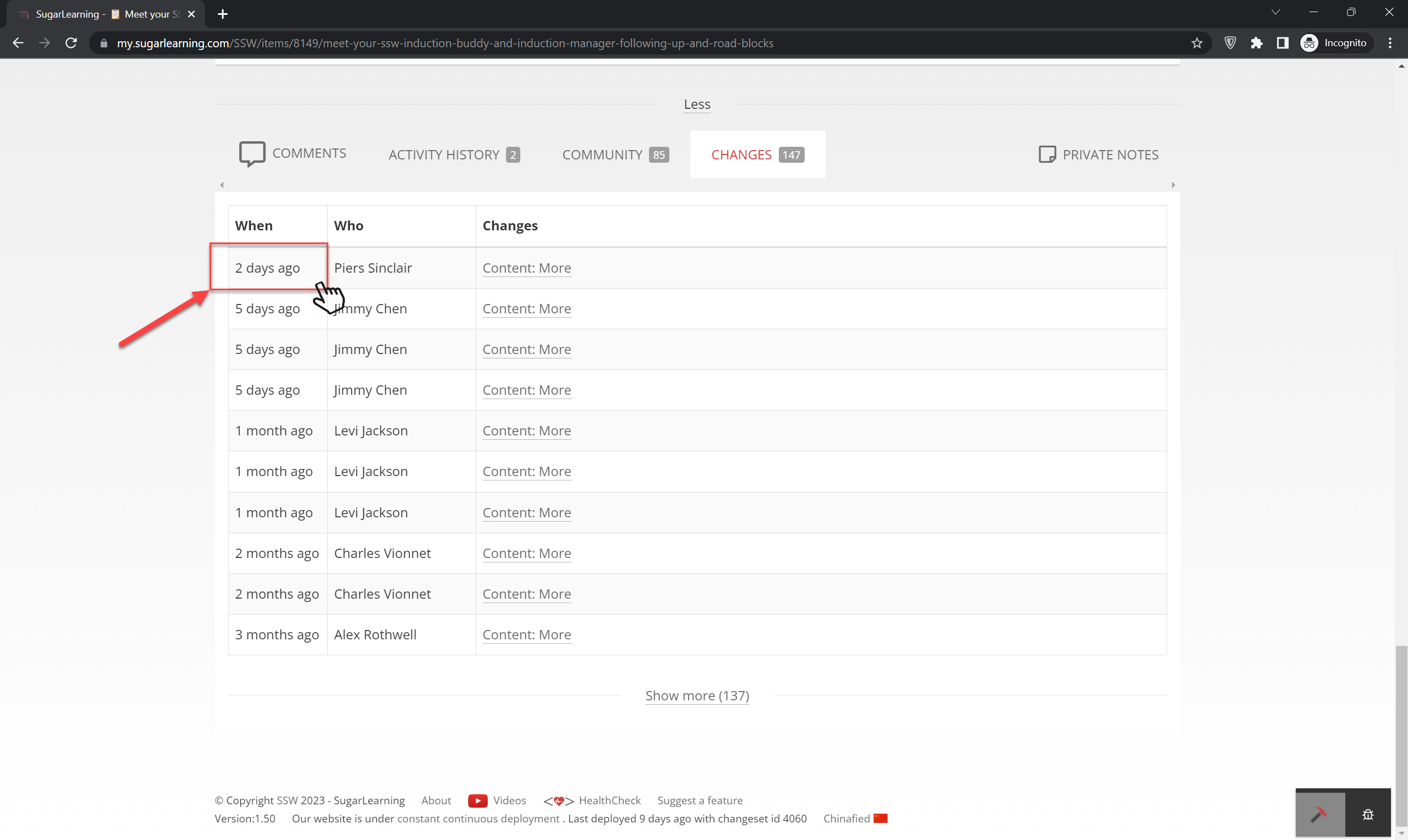
Dates – Do you provide the date and time of change as a tooltip?
Displaying the date and time of change as a tooltip when users hover over the time of change can be an effective approach for interfaces with limited space or when providing both pieces of information together could lead to confusion.
Tooltips allow users to access additional information about the context of the date and time of change without cluttering the main interface.
❌ Figure: Bad example – Cannot find date or time in tooltip on hover
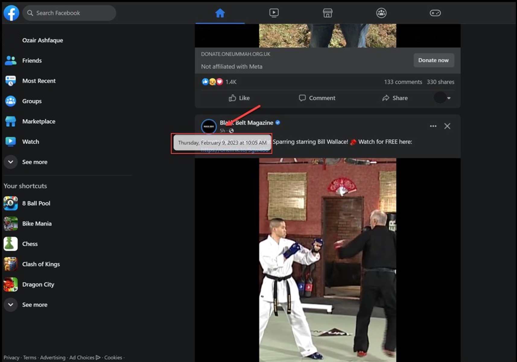
✅ Figure: Good example – On hover, Facebook shows the date and time
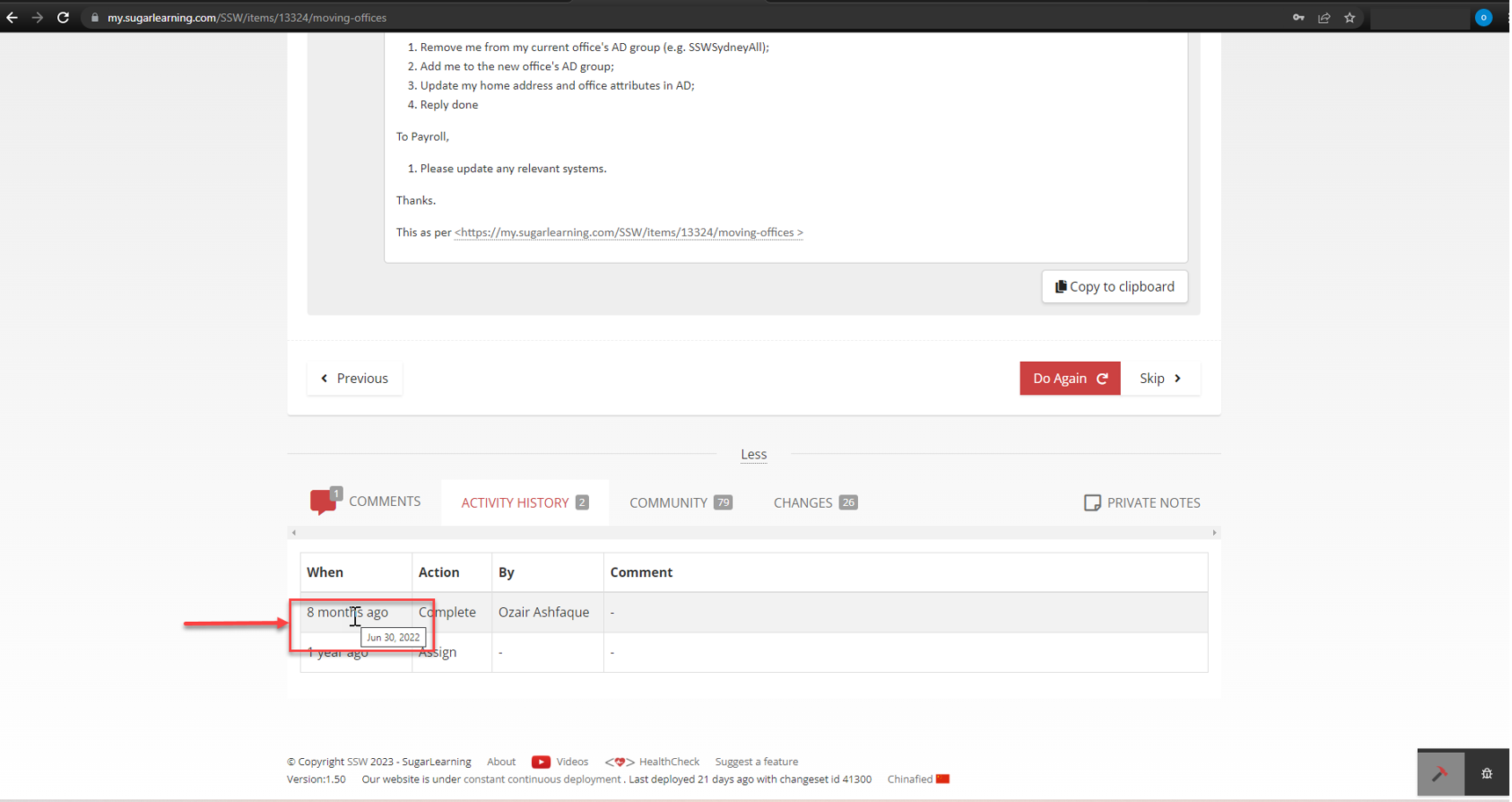
✅ Figure: Good example – Date change on hover over time of change for sugarlearning item
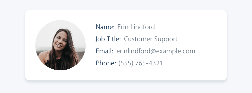
Do you use icons/emojis to enforce the text meaning?
People may not pay attention to some important words in your interface. Adding a simple and clear icon beside the words will make the difference.
For emails and web content, using an simple emoji is an easy and friendly way to achieve the same result 🙂.
Using icons
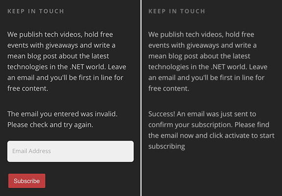
❌ Figure: Bad example - No icons to indicate the status
✅ Figure: Good example - Green tick and red cross help the user to know what's going on
Using emojis
I join a lot of Sprint Reviews, and there is a consistent problem I see among Scrum teams. The PBIs have limited or missing information. Usually, this is due to unclear requirements...
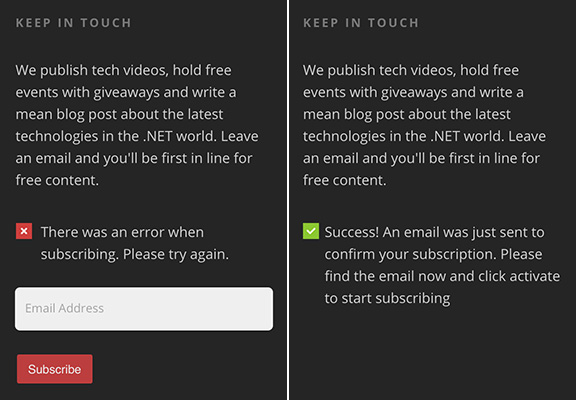
❌ Figure: Bad example - No emojis to enforce the meaning
I join a lot of Sprint Reviews, and there is a consistent problem I see among Scrum teams. The PBIs have limited or missing information 😥. Usually, this is due to unclear requirements...
✅ Figure: Good example - The emoji gives extra focus on what is important
See this rule being used on different scenarios:
- Adding the type of file next to download links (before the text)
- Adding an icon to external links (after the text)
Do you add a spot of color for text emphasis?
When there are key words that you want people to notice, you can add a spot of color on the important word for emphasis.
You should make parts of the text different colors just like you’d highlight or boldface parts of a sentence. The duo colored text will help emphasize your message.
Use colors from your branding/design system when you do this.

Figure: The TV signage has the important words in red
Use color sparingly
While a spot of color can guide attention and improve scannability, overusing color has the opposite effect. If everything is emphasized, nothing stands out.
Too many bright or contrasting elements:
- Create visual noise, making the UI feel cluttered and overwhelming
- Reduce readability and accessibility, especially for users with visual impairments
- Make it harder for users to know what truly matters
Stick to one accent colors per screen or section. Use them intentionally—only for elements that truly require user focus.
::: img-medium good

Figure: See bottom tagline - Don't make the important word “quality software” in red... because you already have red
:::
::: img-medium good

Figure: See bottom tagline - Make the important word “quality software” in red... because you do not have red
:::
Avoid using color for full sentences, even if it's just one word
Color should be used to emphasize keywords or short phrases within a sentence — not to style entire statements.
Tip: Instead of coloring a sentence, add a colored icon (like ✅ or ❌). This keeps the message clear and accessible while still providing visual emphasis.
Use color to guide, not to shout.
::: img-medium bad
Figure: Bad example - Text in green is too much
:::
::: img-medium good
Figure: Good example - Text in content color (white in this dark mode example) with a green tick
:::
Do you understand the importance of language in your UI?
The tone of your application speaks volumes about how users view it. Read this Google documentation on the voice of Android.
Language tips and examples
Tips ❌ Bad examples ✅ Good examples Keep text as short as possible. Avoid wordy, stilted text. Consult the documentation that came with your phone for further instructions. Read the instructions that came with your phone Describe only what the user needs to know and don't provide unnecessary information. Your phone needs to communicate with Google servers to sign in to your account. This may take up to five minutes. Your phone is contacting Google. This can take up to 5 minutes. Focus on the user's concern, not technical details Manually control GPS to prevent other apps from using it. To save power, switch Location mode to Battery saving Put the most important thing first 77 other people +1’d this, including Larry Page Larry Page and 76 others +1’d this Put the user's goal first Touch Next to complete setup using a Wi-Fi connection To finish setup using Wi-Fi, touch Next Avoid being confusing or annoying Sorry! Activity MyAppActivity (in application MyApp) is not responding. MyApp isn’t responding. Do you want to close it? Words and terms examples
❌ Bad examples - Avoid ✅ Good examples - Use cannot, could not, do not, did not will not, you will Contractions: can’t, couldn’t, don’t, didn’t, won’t, you’ll, and so on okay, ok OK please, sorry, thank you Attempts at politeness can annoy the user, especially in messages that say something has gone wrong. Exception: In Japanese, “please” is mandatory and imperative verbs should be localized accordingly (turn on -> please turn on). fail, failed, negative language In general, use positive phrasing (for example, “do” rather than “don’t,” except in cases such as “Don’t show again,” “Can’t connect,” and so on.) me, I, my, mine you, your, yours Are you sure? Warning! Tell user the consequence instead, for example, "You’ll lose all photos and media" Numbers - Do you use separators to improve numbers' readability?
Remember to use dividers when referring to large sums or phone numbers.
- Total: $27216
- Phone: 14XXXXXXXXX
❌ Figure: Bad example - These numbers are unwieldy and difficult to read
- Total: $2,721.65
- Phone: +1 XXX XXX XXXX
✅ Figure: Good example - Symbols or some spaces make these large numbers easier to read
Note: For currency references, different countries use periods in place of commas and vice-versa.
E.g. In the United States and Australia: $2,367.48 / In France and Brazil: $2.367,48.
Do you know how to use storyboards?
Complex documentation can waste time. Many user requirements can be best encapsulated in screen mock-ups. Spend more time on mockups compared with time on documentation.
Do you consider optical alignment?
 Figure: In the first example, although the text is technically aligned, it does not 'look' it. In the second one, the "V" has been moved into the margin, but the optical alignment is now correct
Not only relevant in typography, optical alignment can also be used in forms and web.

❌ Figure: Bad example - The fields are aligned to the radio buttons, but it doesn't "look" good enough

✅ Figure: Good example - It seems neater, even though it is no longer technically aligned
Column Data - Do you make matrix columns as simple as possible?
<imageEmbed alt="Image" size="large" showBorder={false} figureEmbed={{ preset: "badExample", figure: 'Bad example - Hard to read these columns', shouldDisplay: true }} src="/uploads/rules/column-data-do-you-make-matrix-columns-as-simple-as-possible/../../assets/bad-matrixcol.jpg" />
✅ Figure: Good example - The whole table has been re-written and is now easier to understand
Column Data - Do you do alphanumeric down instead of across?
The search direction of a list should be obvious. When it comes to a multicolumn list, you should always head down instead of across for legibility.
Vertical lists are much easier to scan than horizontal lists, because all items are aligned to left, when you're looking for an item, you don't need to read the entire word, you can quickly scan the first letters and get directly to the item you look for.
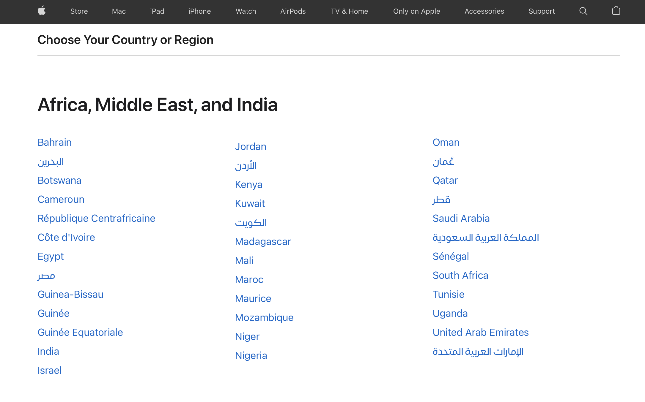
✅ Figure: Good example - Apple.com lists countries in columns vertically
Column Data - Do you know when to use columns or text?
It's OK to use text because it's more natural, but use columns if you need:
- reordering
- side by side comparison
- totals

Figure: While text looks friendlier, in terms of presenting data it's not the easiest to read
Do you make the homepage as a portal?
You should put all the useful and current information on the homepage and also make it easy to find your core functions there.
E.g. Top billing customers for the month and a button under it for adding an invoice. E.g. See the number of bugs counted by the most common.

Figure: The homepage of TWA is a portal
Figure: Microsoft also opens a portal 'homepage'
Authentication - Do you make the logged in state clear?
Remember to make the "logged in" state clear enough to help the user know the current state.

❌ Figure: Bad example on Web form - The user is logged in, but it isn't very clear

✅ Figure: Good example on Web form - It's clear that the user is logged in
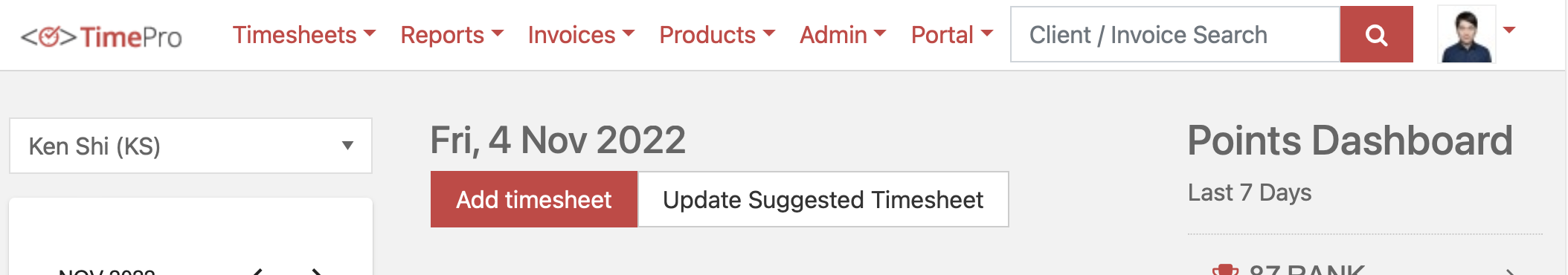
✅ Figure: Good example - TimePro use avatar to state user logged in
✅ Figure: Good example - SugarLearning use avatar to state user logged in
Do you strike-through completed items?
When you're giving an update on progress on a task list or a schedule,
strike outthe items that have been completed. Not only does it visually explain where you are, it also gives you a great sense of satisfaction...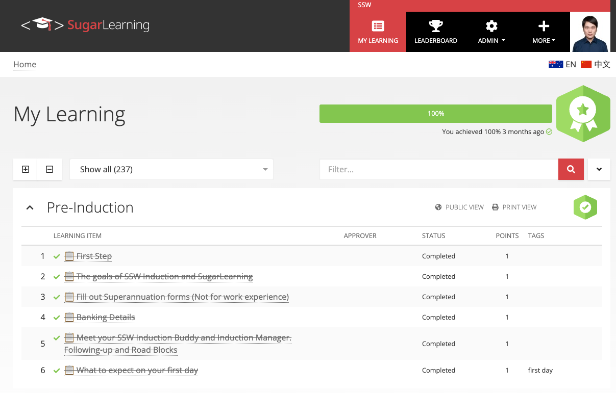
✅ Figure: Good example - SugarLearning's completed items are struck-through
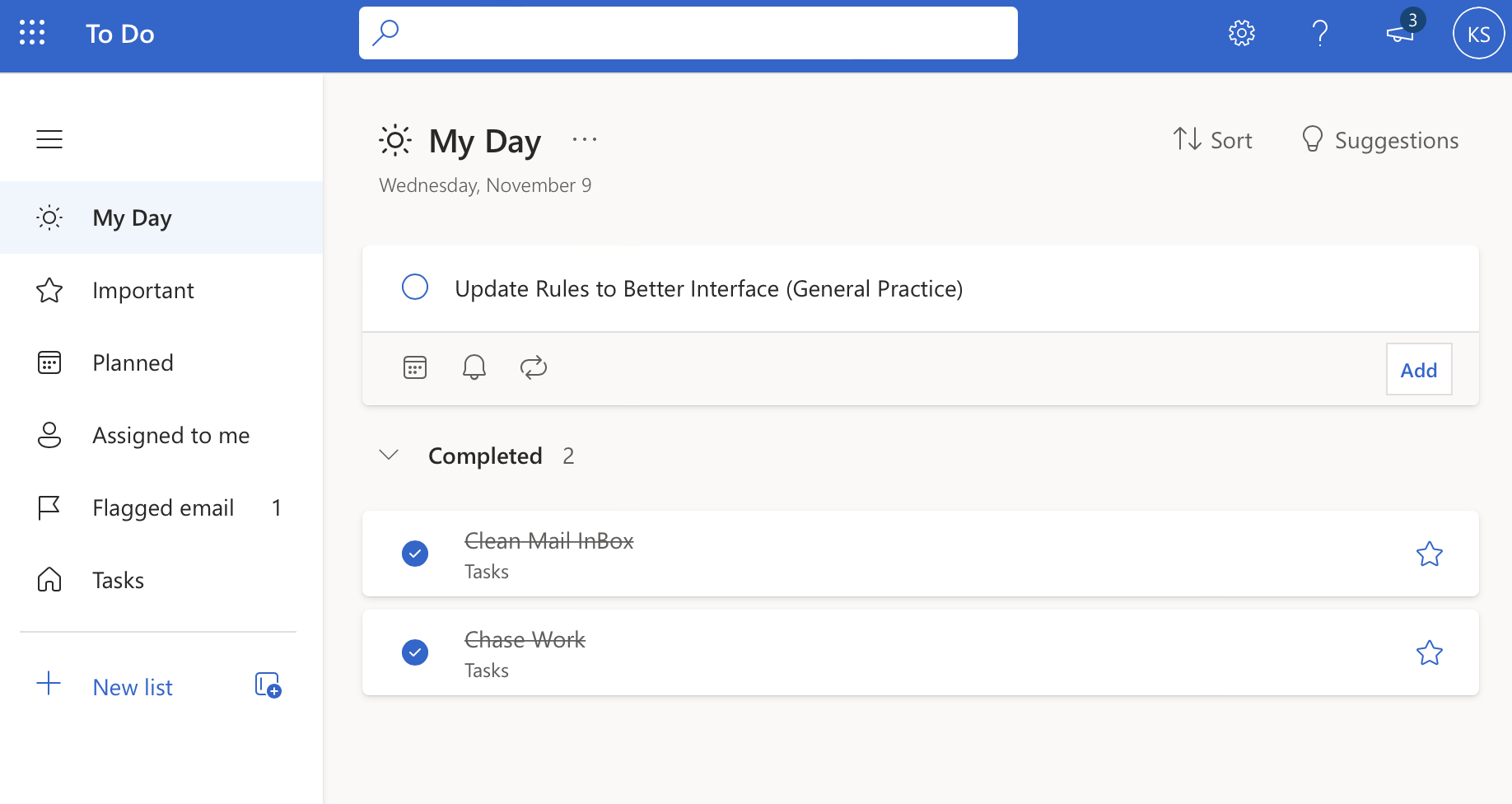
✅ Figure: Good example - Microsoft Outlook Todo's completed tasks are struck-through
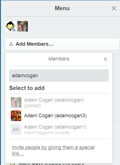
Do you provide options for sharing?
If users want to share information or media, then make it easy for them!
Some common avenues for sharing are:
- Facebook
- Twitter
- Instagram
- LinkedIn
- Google Drive
- Email
- SMS / Messages
- Copy to clipboard
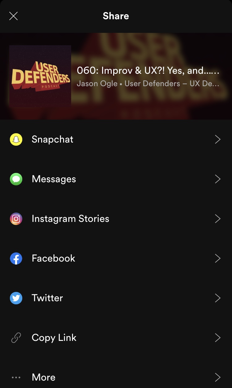
✅ Figure: Good example – Users can easily share media via 6 common avenues and more.
Do you have a "search box" to make your data easy to find?
<imageEmbed alt="Image" size="large" showBorder={false} figureEmbed={{ preset: "goodExample", figure: 'Good example - a "search box" makes it easy to find data', shouldDisplay: true }} src="/uploads/rules/do-you-have-a-search-box-to-make-your-data-easy-to-find/../../assets/EasySearch.png" /><imageEmbed alt="Image" size="large" showBorder={false} figureEmbed={{ preset: "goodExample", figure: 'Good example - the search bar in Windows 8 is now always in the same position, no matter what program or where you are searching for. You can activate Charms in Windows 8 by mousing to the top right corner.', shouldDisplay: true }} src="/uploads/rules/do-you-have-a-search-box-to-make-your-data-easy-to-find/win8search.jpg" />
<figureEmbed figureEmbed={{ preset: "goodExample", figure: 'Figure: Good Example - TFS Preview has an easy to find search box.', shouldDisplay: true } } />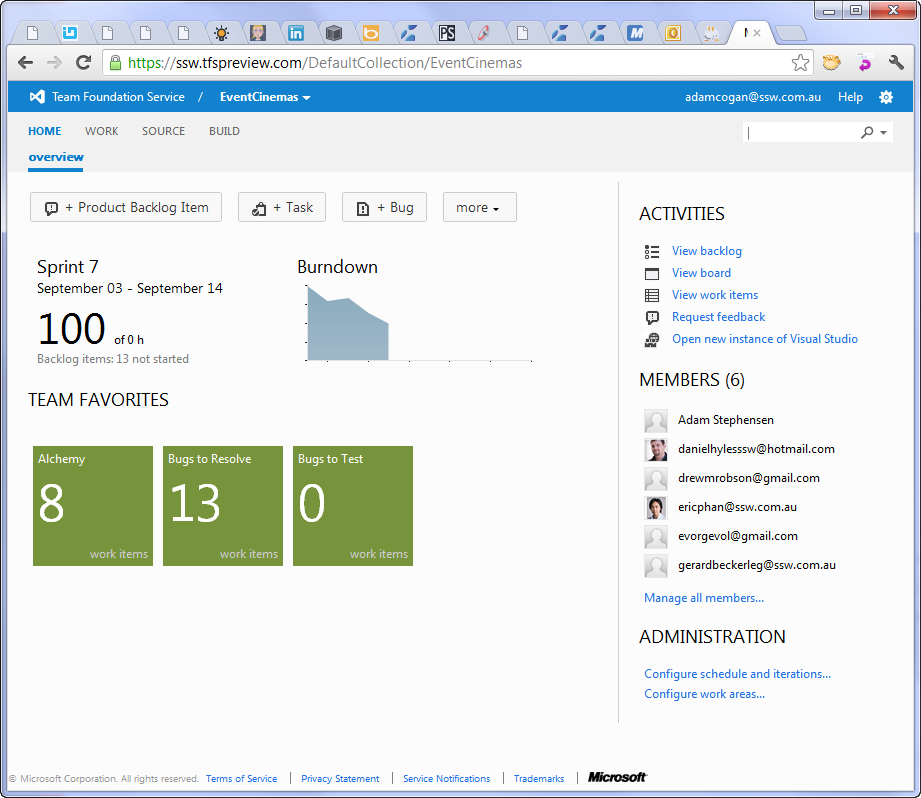
Do you know how to use "gamification"?
"Gamification" is a method of encouraging user participation. Usually, these are a set of incentives such as points or achievement badges that are linked to some other form of redeemable value.
It originated with Frequent Flyer programs and has crossed over into the software world with the success of Foursquare.
This concept is being utilized even in Visual Studio.
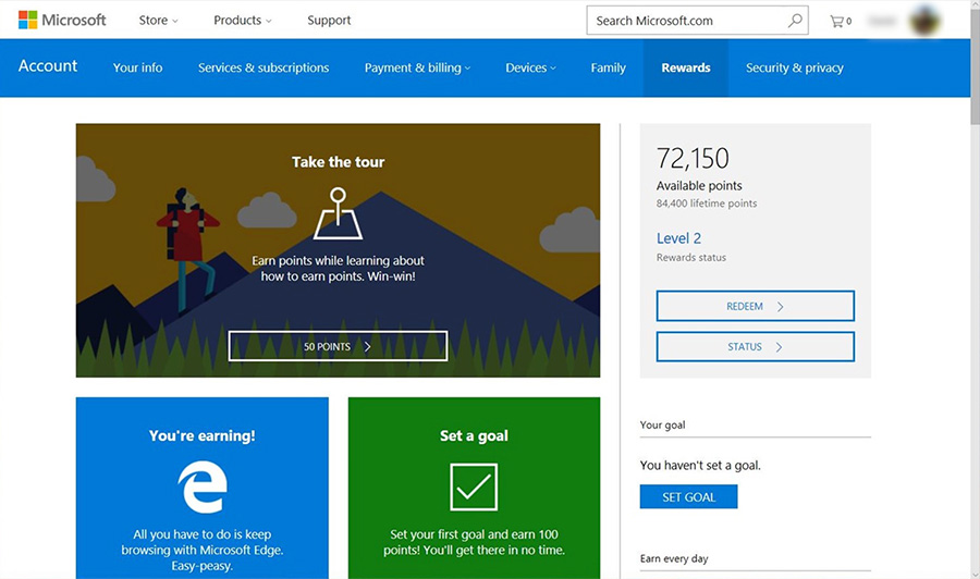
✅ Figure: Good Example – Microsoft Rewards gives points when you search on Bing.com and buy things from the Microsoft Store online and in Windows 10
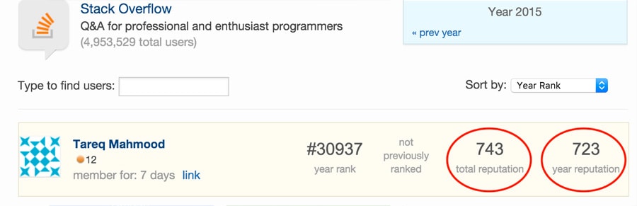
✅ Figure: Good Example – Stack Overflow uses reputation points, awarded by how useful your answer to other user submitted questions were
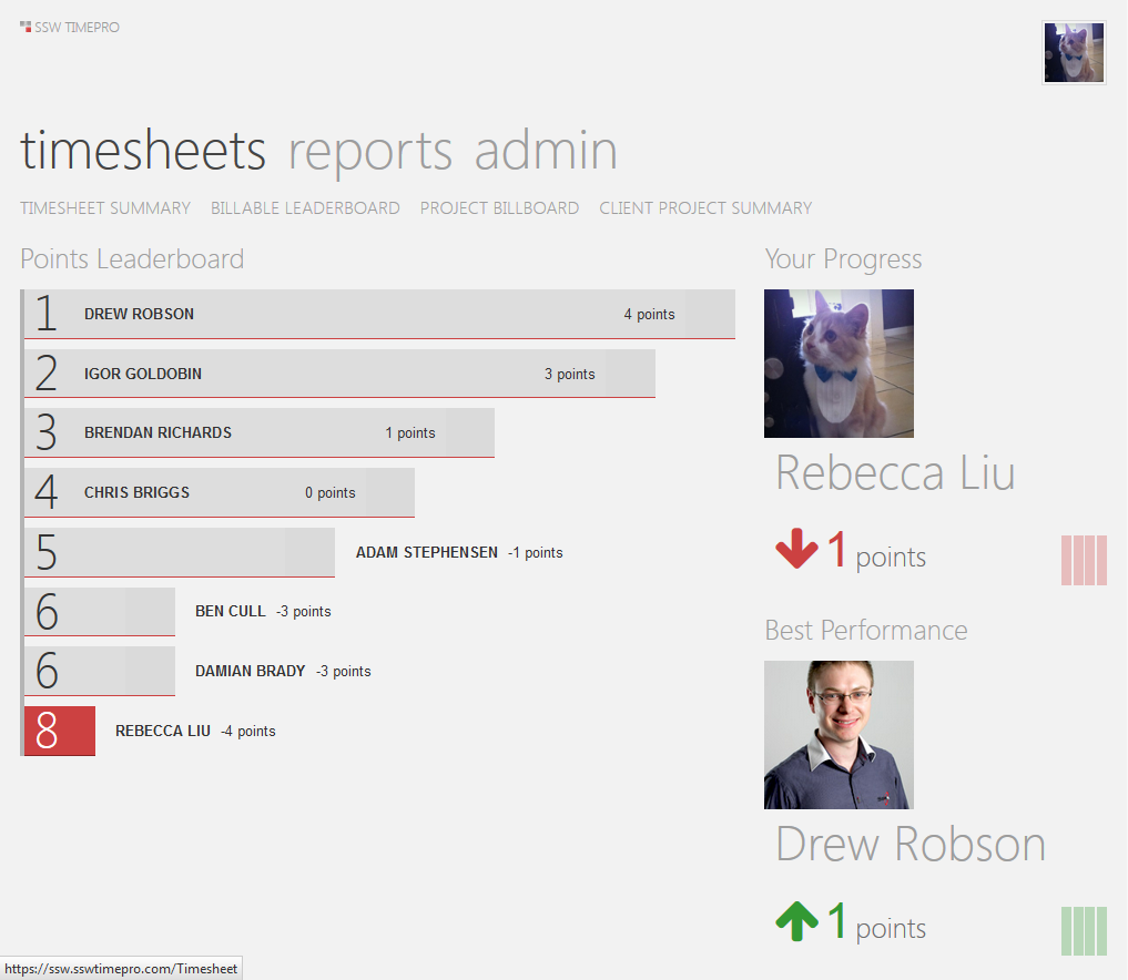
✅ Figure: Good Example – TimePro uses gamification to encourage users to do their timesheets on time
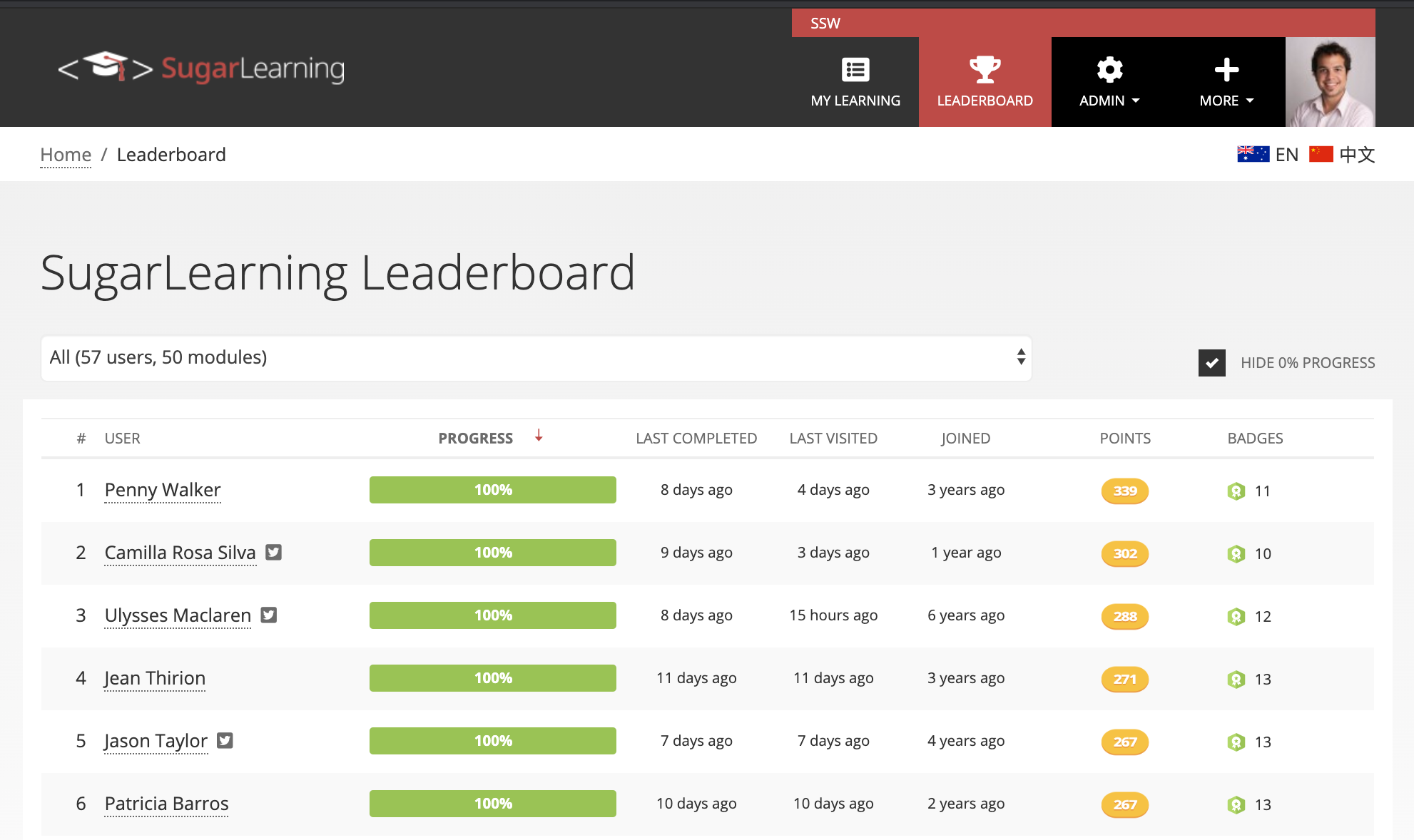
✅ Figure: Good Example – SugarLearning Leaderboard is another good example
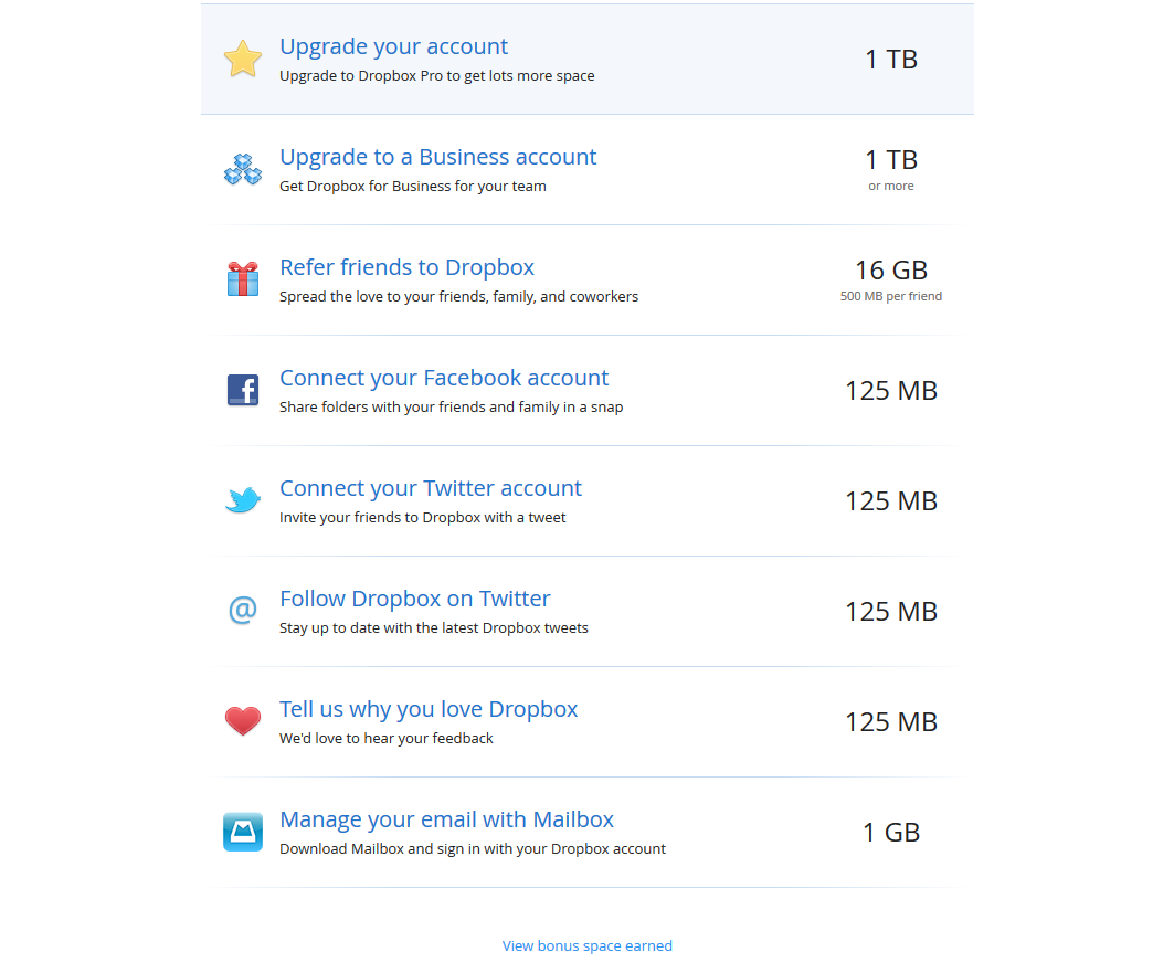
✅ Figure: Good Example – Dropbox rewards its users with extra storage space instead of imaginary points. This is more interesting
Do you encourage experimentation?
Encourage experimentation to increase comfort:
- Undo
- Remember your last state
- Live preview
✅ Figure: Good example - Micorosoft Word uses Live Preview to show what styles look like
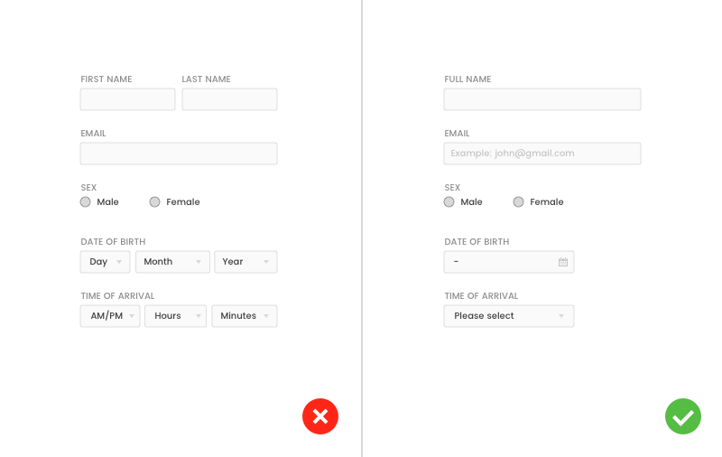
Do you avoid “OK” buttons and use the specific action as labels instead?
While "OK" buttons were the standard convention with operating systems of the past, web applications should use a more user-friendly approach to dialog boxes. Instead of "OK" buttons to confirm an action the users want, it’s more efficient and effective to give them button that is labeled with that specific action.
❌ Figure: Bad example - web application button labeled as "OK"
✅ Figure: Good example - button is labeled with the specific action
Do you have a "last taken" option?
The best apps predict what the user is trying to do from context and does it for them.
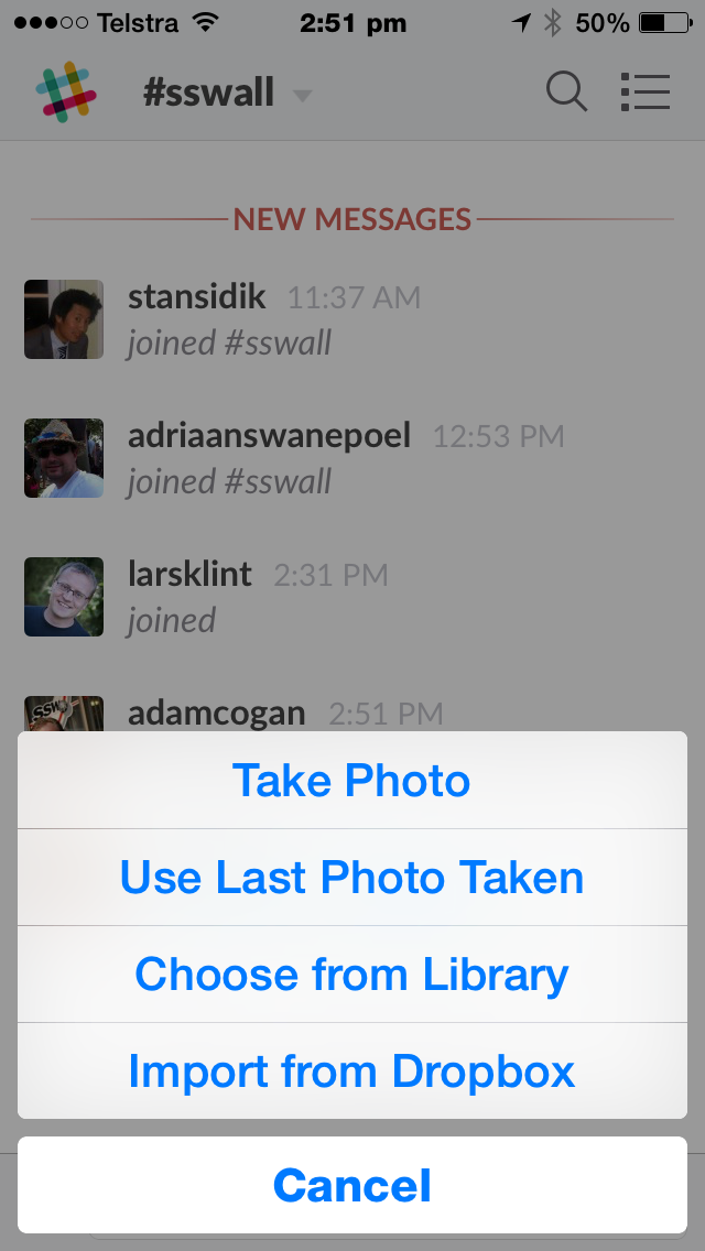
✅ Figure: Figure: Good Example – “Use Last Photo Taken” is a simple example from Slack.
This is generally referred to as an “adaptive system.”
Smashing magazine has a much more detailed article regarding adaptive systems from 2012 along with advanced examples.
Do you have a "request access" button in pages that require permission?
If your page requires permission to be accessed it should provide a button for the user to request it.
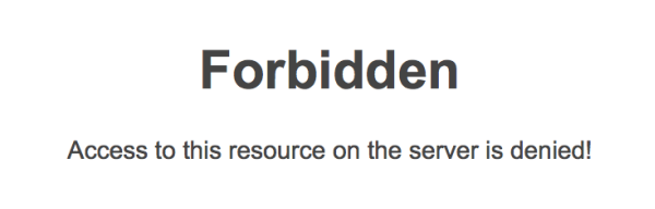
❌ Figure: Bad example - You just don't have access
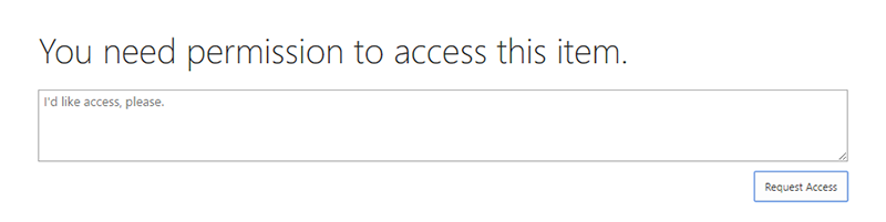
✅ Figure: Good example – Office 365 has a "Request Access" button
Do you have a clean “no match found” screen?
When a user looks at a search result, they expect to see a list of items to look into. If there are no results, don't give them noisy text because it can be taken as a search result. An icon also can be understood as a broken page. Your "no results" page should be clean.
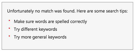
❌ Figure: Bad example - The list of "suggestions" is just noise and can confuse the user
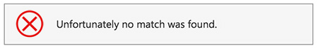
❌ Figure: Bad example - Having an icon implies that an error happened which is not the case
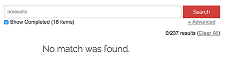
✅ Figure: Good example - Plain and clean screen
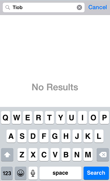
✅ Figure: Good example - Plain and clean screen on mobile
Note: In case the message you're showing is a "pass" or "fail, it is recommended to use an icon as per Do you use icons to enforce the text meaning?
Do you highlight the search term?
When implementing search on a website, do you know that it is best to highlight the search terms in the page body?
Search is a common feature in websites, and one you will most likely have to implement at some stage. When search returns a list of items, it is useful to highlight the search terms where they appear in the results.
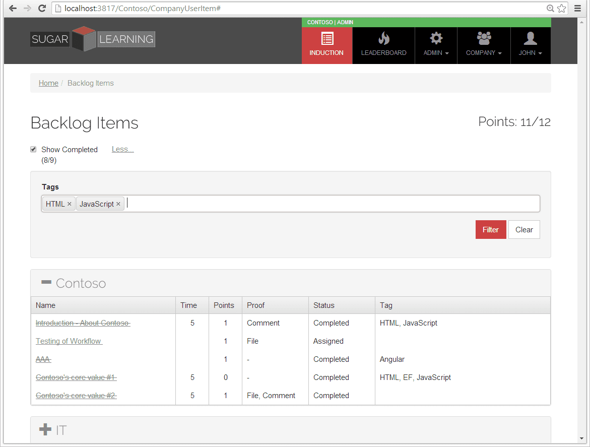
❌ Figure: Bad example - Search for items with these tags
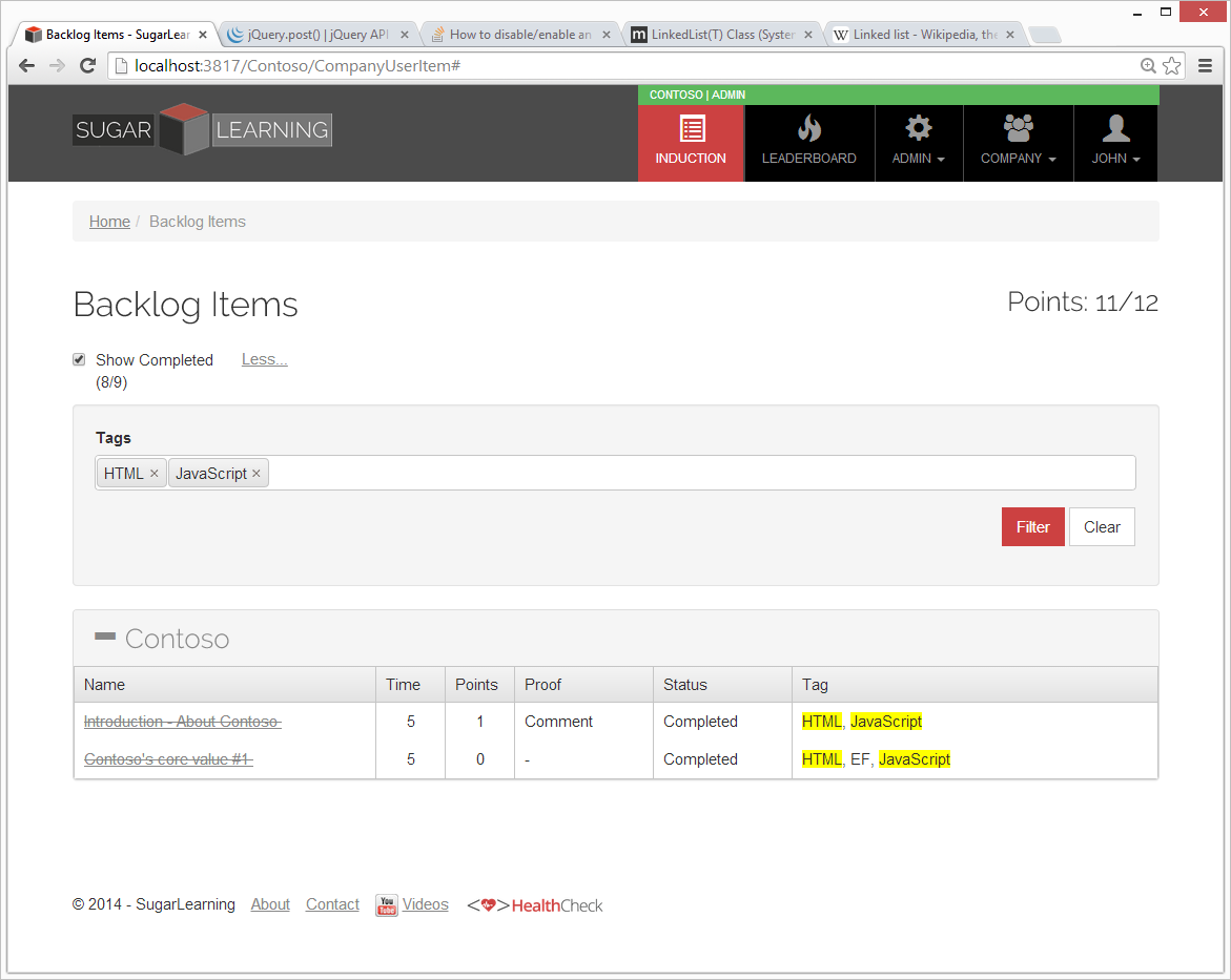
✅ Figure: Good example - Search results have their relevant tags highlighted
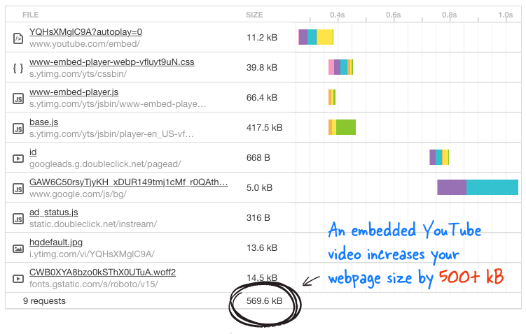
Do you know the right way to embed a YouTube video?
When you embed a YouTube video it will increase your page size from 500kbs to 1.5Mb or more, depending on how many videos are embedded on the page.
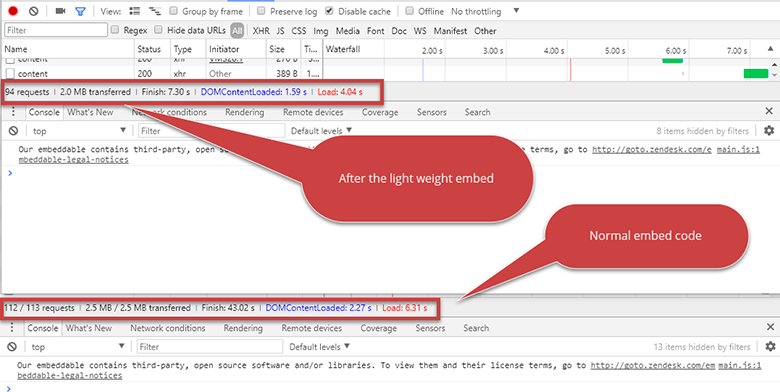
Figure: A side by side comparison – everyone wants less requests and a smaller page size
❌ Figure: Bad example - Don’t add embed code directly from YouTube. For more details read "A Better Method for Embedding YouTube Videos on your Website"
<iframewidth="560"height="315"src="https://www.youtube.com/embed/eu0qhzevEXQ"frameborder="0"allowfullscreen></iframe>❌ Figure: Figure: Bad example – The evil HTML code
There is a clever, lightweight way to embed a YouTube video, which Google itself practices on their Google+ pages which reduce it to 15kbs. All you have to do is, whenever you need to embed a video to a page, add the below tag instead of the YouTube video embed code. (Remember to replace VIDEO_ID with actual ID of the YouTube video)
<div class="youtube-player" data-id="VIDEO_ID"></div>✅ Figure: Figure: Good example – The good HTML code
Note: This script needs to be added at the end of the document:
<script>/* Light YouTube Embeds by @labnol *//* Web: http://labnol.org/?p=27941 */document.addEventListener("DOMContentLoaded", function () {var div,n,v = document.getElementsByClassName("youtube-player");for (n = 0; n < v.length; n++) {div = document.createElement("div");div.setAttribute("data-id", v[n].dataset.id);div.innerHTML = labnolThumb(v[n].dataset.id);div.onclick = labnolIframe;v[n].appendChild(div);}});function labnolThumb(id) {var thumb = '<img src="https://i.ytimg.com/vi/ID/hqdefault.jpg">',play = '<div class="play"></div>';return thumb.replace("ID", id) + play;}function labnolIframe() {var iframe = document.createElement("iframe");var embed = "https://www.youtube.com/embed/ID?autoplay=1";iframe.setAttribute("src", embed.replace("ID", this.dataset.id));iframe.setAttribute("frameborder", "0");iframe.setAttribute("allowfullscreen", "1");this.parentNode.replaceChild(iframe, this);}</script>..and this needs to be added in the CSS:
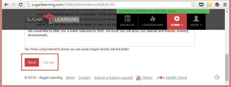
<style>.youtube-player {position: relative;padding-bottom: 56.23%;/* Use 75% for 4:3 videos */height: 0;overflow: hidden;max-width: 100%;background: #000;margin: 5px;}.youtube-player iframe {position: absolute;top: 0;left: 0;width: 100%;height: 100%;z-index: 100;background: transparent;}.youtube-player img {bottom: 0;display: block;left: 0;margin: auto;max-width: 100%;width: 100%;position: absolute;right: 0;top: 0;border: none;height: auto;cursor: pointer;-webkit-transition: 0.4s all;-moz-transition: 0.4s all;transition: 0.4s all;}.youtube-player img:hover {-webkit-filter: brightness(75%);}.youtube-player .play {height: 72px;width: 72px;left: 50%;top: 50%;margin-left: -36px;margin-top: -36px;position: absolute;background: url("//i.imgur.com/TxzC70f.png") no-repeat;cursor: pointer;}</style>Do you know to provide a "Save and Close" option?
When the user is creating or editing data on a webpage, there are two buttons and one link you need to provide.
So the options are:
- Save (button) - Saves the data and allows the user to keep editing
- Save and Close (button) - Saves the data and returns to the previous screen
- Cancel (link) - returns to the previous screen
❌ Figure: Bad example - only provided "Save" button and "Cancel" link
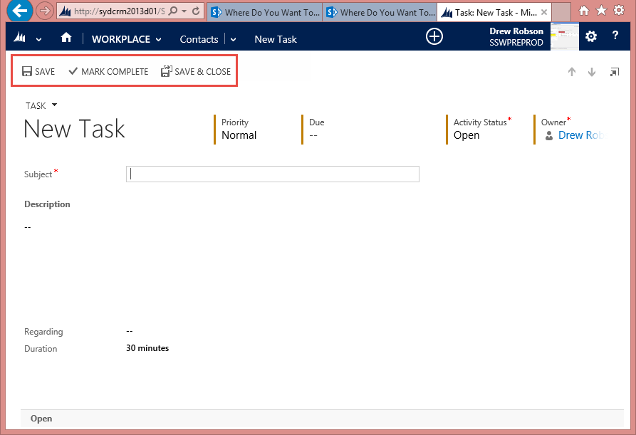
✅ Figure: Good example - CRM 2013 provides a "Save" button and a "Save and Close" button
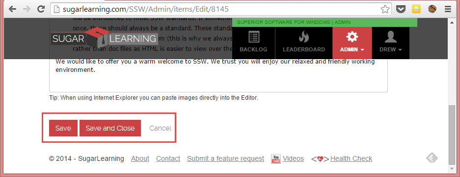
✅ Figure: Better example - SugarLearning provides a "Save" button, a "Save" and Close" button, and a "Cancel" link
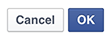
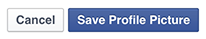
Do you make your cancel button less obvious?
To avoid users accidentally cancelling an operation when they thought they where clicking the save button you should always make your cancel button less obvious.
❌ Figure: 
✅ Figure: 
Which side should the cancel button be on?
It depends which operating platform your program runs on:
- Windows - On the right
- Apple, iOS and Android - On the left
- Web - Generally on the right
If you're designing a Web-based application, the decision is harder, but you should probably go with the platform preferred by most of your users. Your server logs will show you the percentage of Windows vs. Mac users for your specific website or intranet. Of course, Windows generally has many more users, so if you can't be bothered to check the logs, then the guideline that will apply to most situations is OK first, Cancel last.
What do you name your buttons?
It's often better to name a button to explain what it does, than to use a generic label like "OK". An explicit label serves as "just-in-time help," giving users more confidence in selecting the correct action.
Make the most commonly selected button the default and highlight it. Except if it's action is particularly dangerous; in those cases, you want users to explicitly select the button rather than accidentally activating it by hitting Enter.
Further Reading:
- Nielsen Norman - The usability guru talking about ok and cancel buttons
Do you clearly show what is inactive/disabled?
Make it clear when something is inactive of disabled. Reducing the opacity is a great way to indicate that.
✅ Figure: Good example - Microsoft Teams clearly shows inactive users