Do you have a clean “no match found” screen?
Updated by Brady Stroud [SSW] 1 year ago. See history
When a user looks at a search result, they expect to see a list of items to look into. If there are no results, don't give them noisy text because it can be taken as a search result. An icon also can be understood as a broken page. Your "no results" page should be clean.
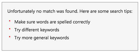
❌ Figure: Bad example - The list of "suggestions" is just noise and can confuse the user
❌ Figure: Bad example - Having an icon implies that an error happened which is not the case
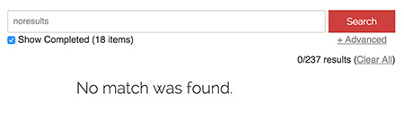
✅ Figure: Good example - Plain and clean screen
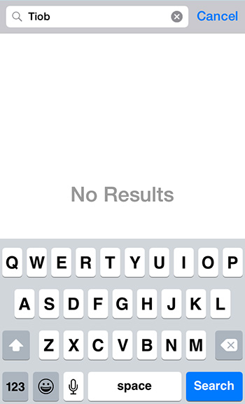
✅ Figure: Good example - Plain and clean screen on mobile
Note: In case the message you're showing is a "pass" or "fail, it is recommended to use an icon as per Do you use icons to enforce the text meaning?
Categories
Acknowledgements


Need help?
SSW Consulting has over 30 years of experience developing awesome software solutions.