Rules to Better Figma
Do you know the best software for user experience design?
There are a few options when it comes to the best software for UI/UX design (the creation of mockups and prototypes in particular). The most popular are:
- V0.dev (recommended)
- Figma (recommended)
- Adobe XD
- Sketch (MacOS only)
The goal of any designer is to develop the best UI and develop the best user experience possible, and you want the best tool to help achieve this. Figma is the ideal design tool - highly collaborative, accessible cross-platform, and cloud-based. In addition to these features it comes with a huge suite of unique design tools. The auto-layout feature, for example, helps designers craft highly responsive products in a way that reflects actual CSS properties like grids and flexbox which serves to ease the transition between design and development.
Figure: Figma helps designers bring ideas to life in a wireframe or prototype.Why Figma?
- No need for installation or updates (browser-based)
- Unlimited view-only collaborators on every project
- Unlimited version history with version control (30-day history for free users)
- Unlimited files and cloud storage
- Auto-save
- Collaboration and handover is streamlined with a shared workspace and exportable assets
- Libraries of reusable components, text, colour and layer styles
- FigJam is a built-in whiteboard tool for mapping and discovery
- A huge and highly engaged community
Note: One tool doesn't always replace the others! Figma does not include the print design and photo editing features of Adobe Photoshop and other software also used by designers. Photoshop is the industry standard in raster (pixel-based) graphics editing, photography and digital art. Adobe Illustrator, on the other hand, is the standard vector-based design tool used for print design, logos, icons and more. All of these tools have a place on a designer's belt!
Do you build interactive prototypes in Figma?
Figma is a powerful design tool that offers several prototyping features that are valuable for UI designers. Here are a few of the top Figma prototyping features: <youtubeEmbed url="https://youtu.be/-d6zNGeF59M?si=dYJCN_Hf3zKXiHTX" description="Video: Figma Tutorial: Prototyping & Transitions (5 min)" /> ## **Best practices for prototyping:** ### Create interactive components Add interactions to your Figma components (vs Frames) to create more dynamic and scalable interfaces. You can define different states of a component, such as default, hover, active or focus and make transitions between these states. This helps simulate how users interact with the final product, providing a more realistic representation of the user experience. <figureEmbed figureEmbed={{ preset: "goodExample", figure: '', shouldDisplay: true } } /> ### Design responsive layouts Responsive design is the backbone of creating exceptional user experiences across various devices, and in the realm of design, Figma stands out as an invaluable tool for bringing this concept to life. Responsive design is not just about adapting to different screen sizes; it's about crafting interfaces that seamlessly adjust to diverse contexts, ensuring usability and visual coherence. Figma provides a comprehensive set of features that enable designers to create responsive layouts, preview designs across breakpoints, and streamline the entire responsive design process. <figureEmbed figureEmbed={{ preset: "goodExample", figure: '<imageEmbed alt="Image" size="large" showBorder={false} figureEmbed={{ preset: "default", figure: \'SSW Rewards Admin responsive navigation\', shouldDisplay: true }} src="/uploads/rules/figma-prototypes/auto-layout.gif" />', shouldDisplay: true } } /> ## Bonus tips - Start with low-fidelity prototypes - Focus on key interactions - Consider user flow and navigation - Use realistic content - Test on real devices - Accessibility considerations - Maintain consistencyDo you know Figma's top uses?
Figma is a cloud-based design and prototyping tool that enables designers, developers, and teams to collaborate in real-time on the same design files.
Video: What is Figma? (5 min)It's widely used in the design industry for its simplicity, efficiency, and collaborative features. Figma is accessible through a web browser or desktop application, making it easy to work from anywhere.
Top 5 uses of Figma in a development project:
- User Interface (UI) Design: Figma is primarily used for creating UI designs. Its intuitive interface allows designers to craft pixel-perfect layouts, design elements, and visual components for websites, web applications, mobile apps, and other digital products.
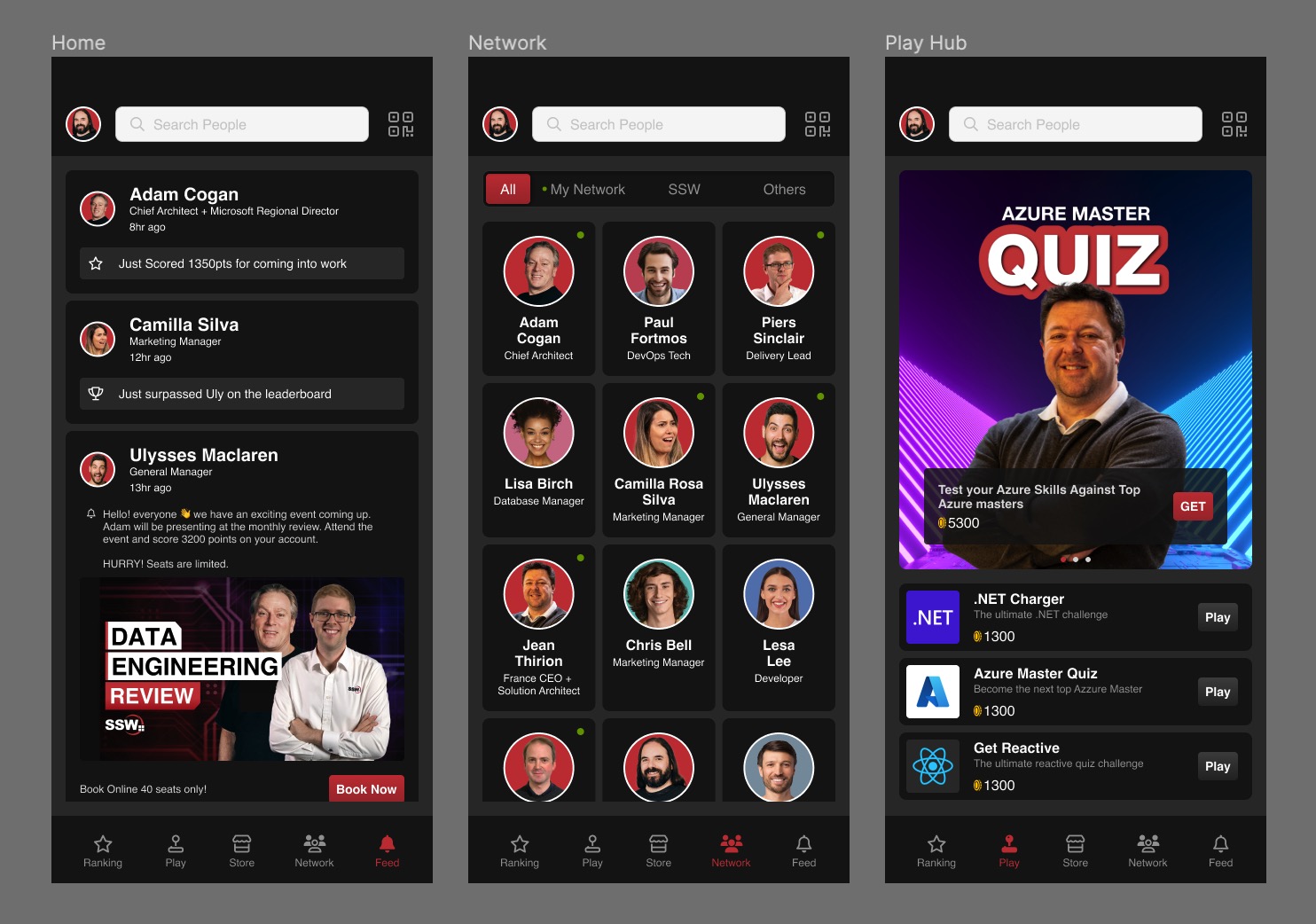
Figure: SSW Rewards mockup design
- Prototyping: With Figma's powerful prototyping features, designers can create interactive prototypes demonstrating their designs' flow and functionality. This helps developers and stakeholders better understand the user experience and interactions before development begins.
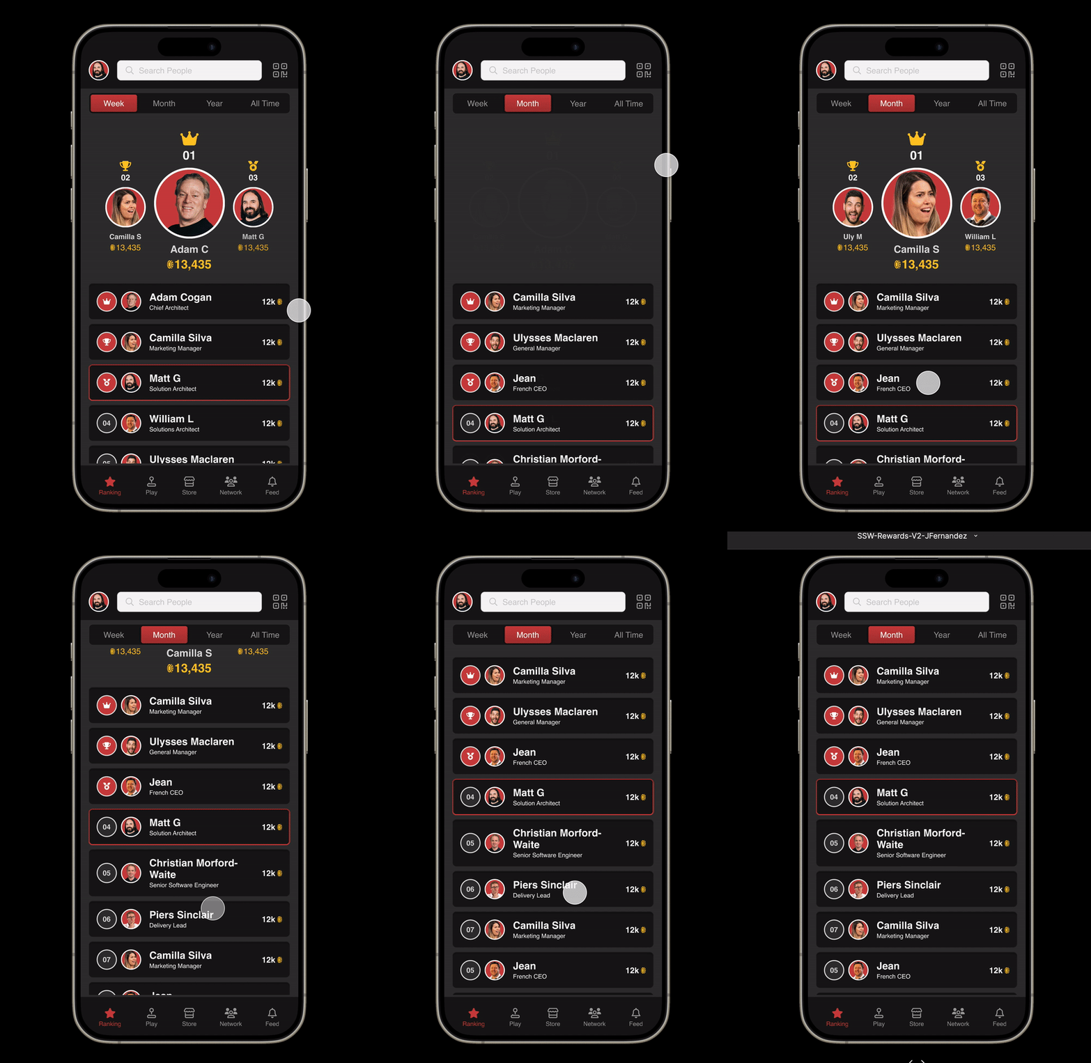
Figure: SSW Rewards interactive prototype
- Collaboration and Feedback: Figma's real-time collaboration capabilities enable multiple team members to work simultaneously on the same project. This fosters a collaborative environment where designers, developers, and other stakeholders can provide feedback, comment, and iterate on designs.
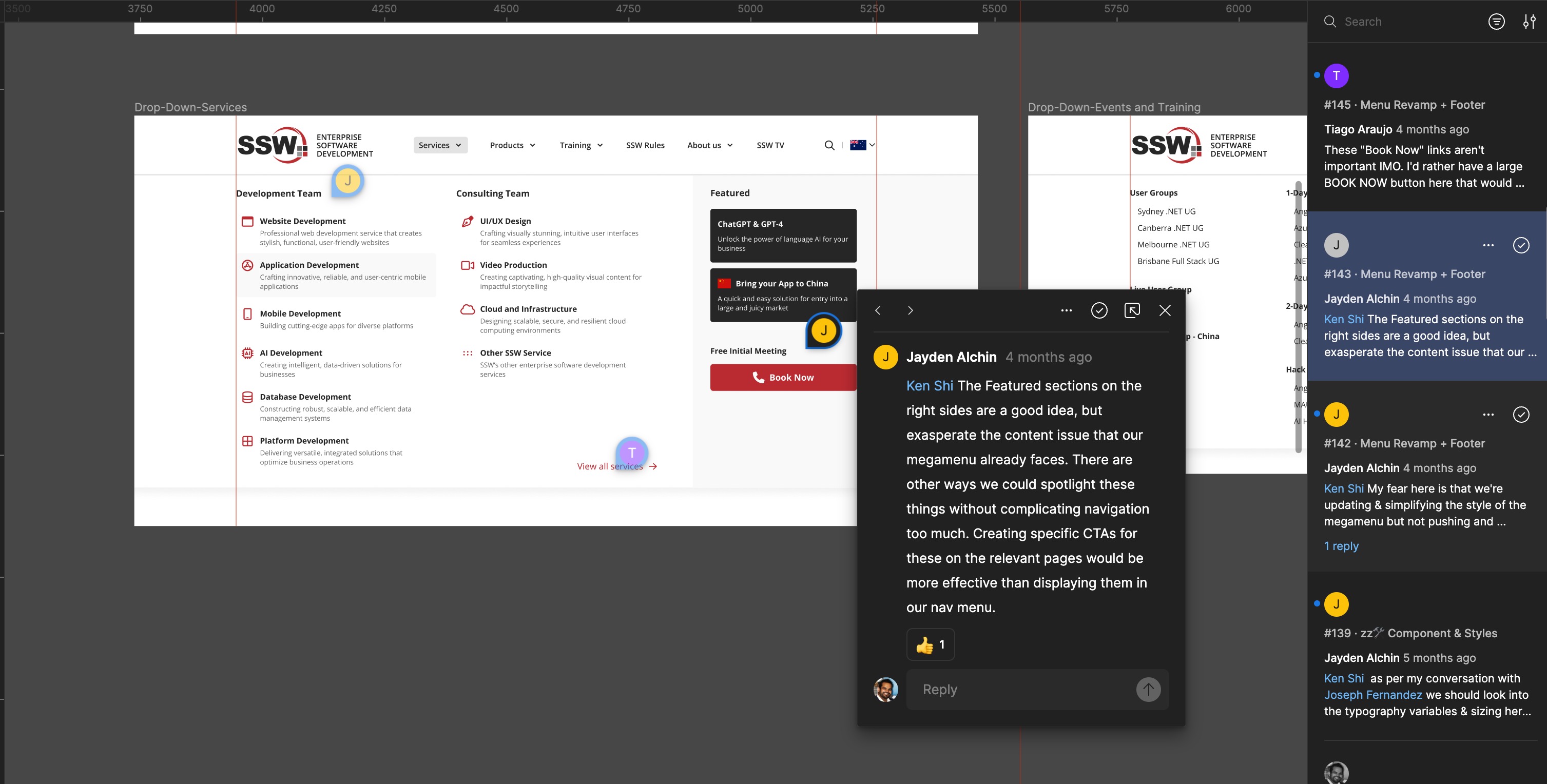
Figure: Real time feedback and collaboration
- Design Systems: Figma is popular for building and maintaining design systems. Designers can create reusable components, styles, and libraries, streamlining the design process and ensuring consistency throughout the project.
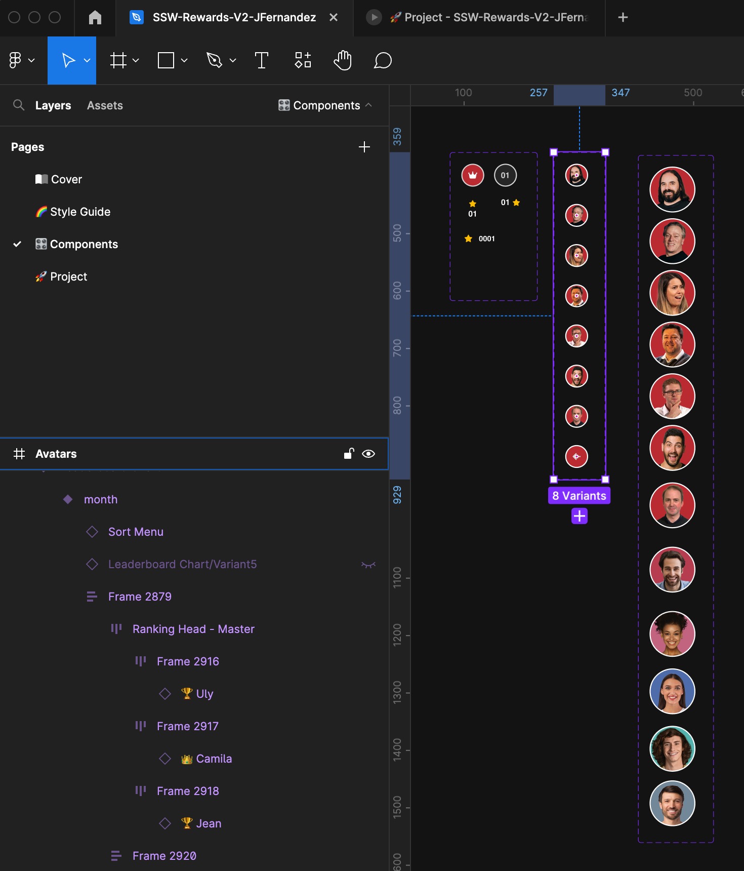
Figure: Re-usable components
- Developer Handoff: Figma simplifies the handoff process from design to development. Designers can generate design specs, export assets, and provide CSS code snippets to developers. This streamlines the communication between design and development teams, ensuring that the final product matches the intended design.
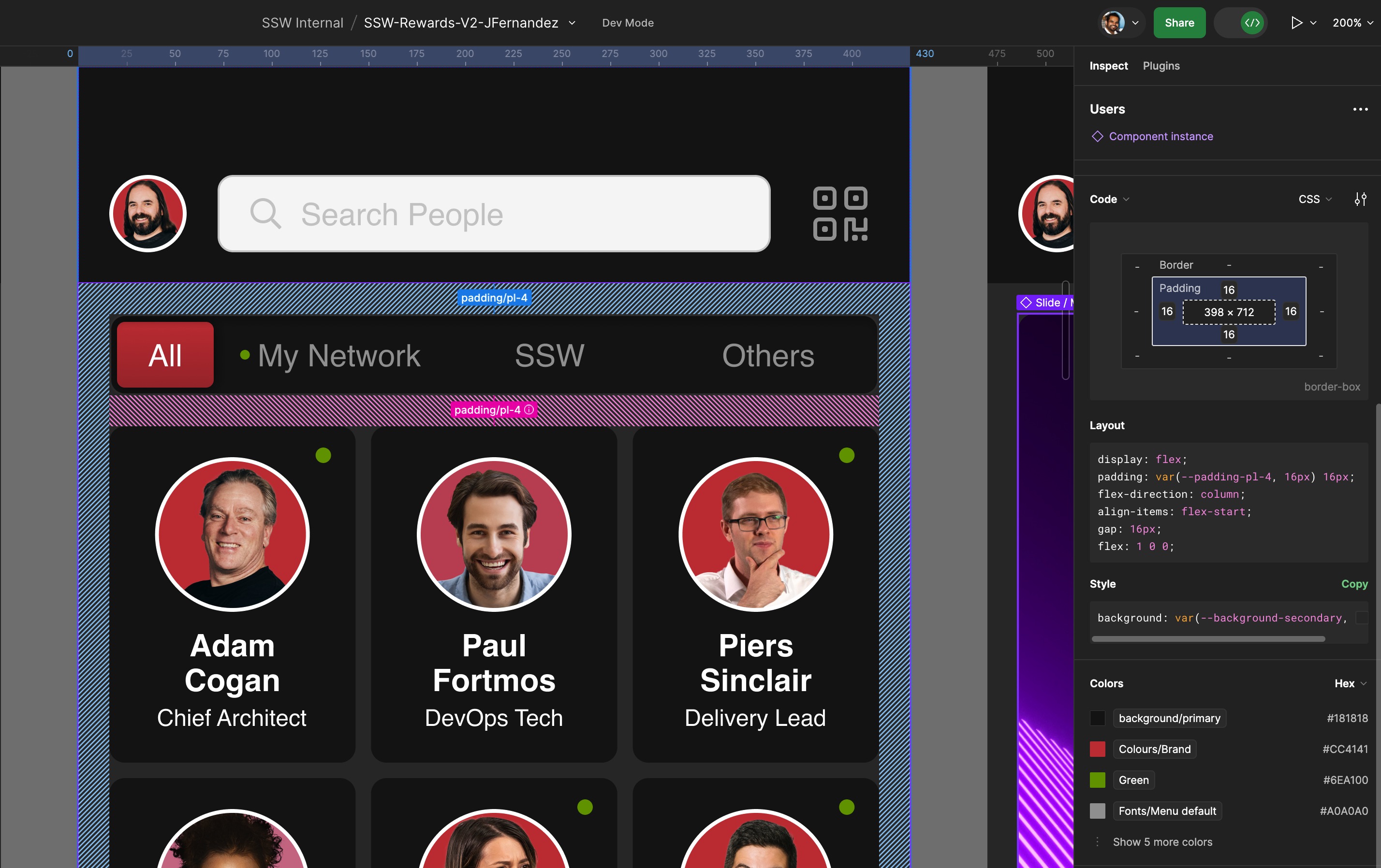
Figure: Figma in Dev mode
Figma's versatility, real-time collaboration, and design system capabilities make it a valuable tool in the design and development workflow, helping teams create high-quality digital products efficiently.
Do you use Figma Dev Mode to improve developer handovers?
One of the biggest pain points during design-to-development handover is the loss of information or miscommunication between teams. Designers might create stunning designs, but without clear specifications, developers can struggle to implement them accurately. This often results in back-and-forth clarifications, missed deadlines, and frustration.
Figma Dev Mode solves this issue by offering developers all the necessary design details in a developer-friendly format. With access to measurements, code snippets, and assets, developers can easily translate designs into code without needing constant input from designers.
Video: Intro to Dev Mode (4 min 25 sec)Benefits of Using Figma Dev Mode
- Reduced Friction: All design assets are presented in a format developers can immediately use, reducing misunderstandings.
- Code Snippets Ready to Use: Extract CSS, Swift, or Android code directly from the design elements.
- Access to Design Properties: Measurements, spacing, and font details are available in one place, eliminating the need to switch between tools.
- Downloadable Assets: Developers can directly download production-ready images and icons from Figma without requesting files from designers.
- Version Control Visibility: See updates and changes in real-time, ensuring everyone is aligned with the latest design iteration.
How to Use Dev Mode Effectively
- Enable Dev Mode: Designers need to switch to Dev Mode before handing over a file.
- Use Comments for Clarifications: Encourage designers to leave notes for developers on any specific behaviors or constraints.
- Organize Components: Properly named layers and components help developers quickly find relevant assets.
- Test Asset Downloads: Ensure assets are correctly prepared and named for development to prevent rework.
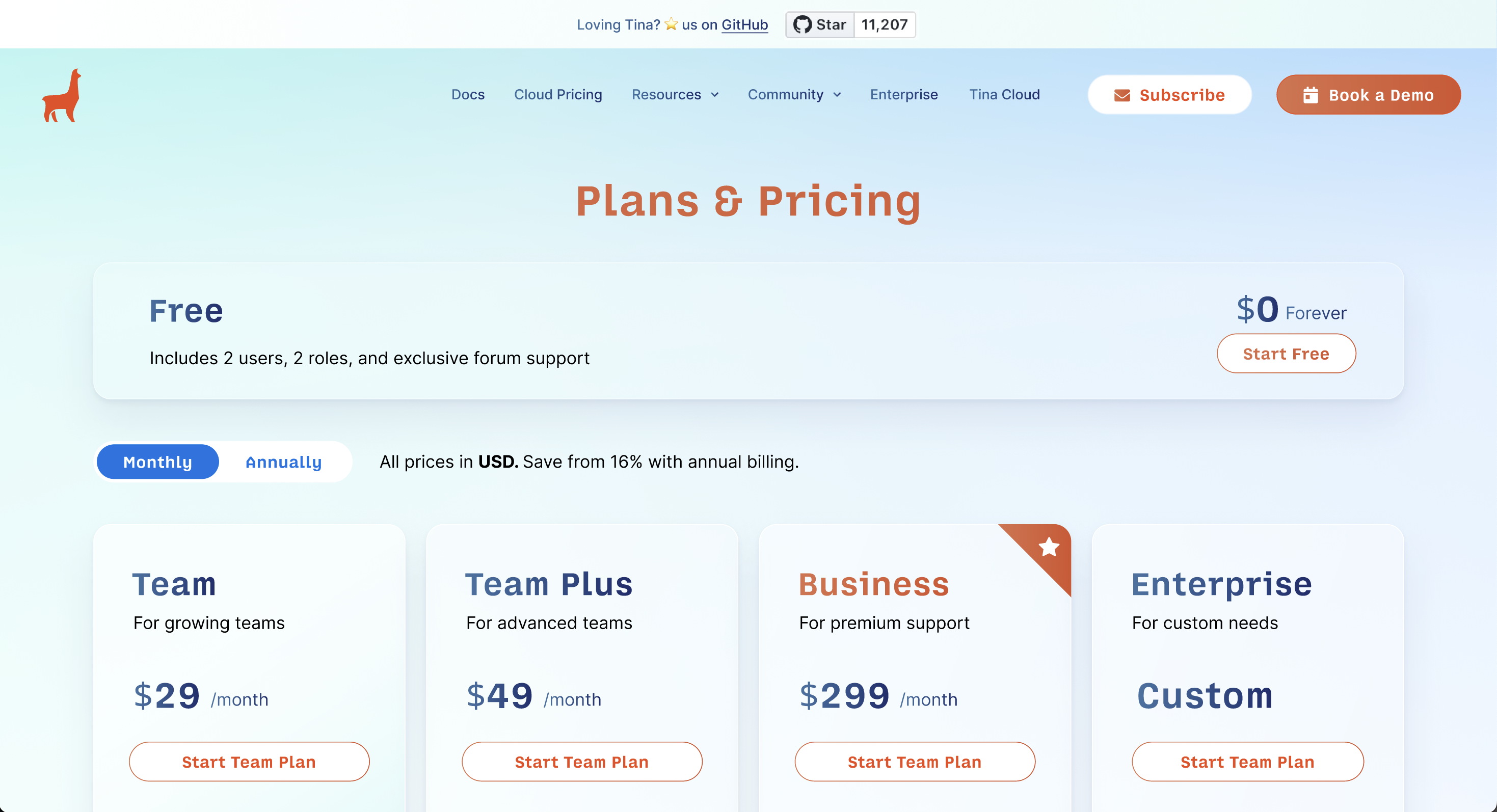
❌ Figure: Bad Example - A basic mockup or prototype with no technical details, forcing developers to guess measurements and styles.
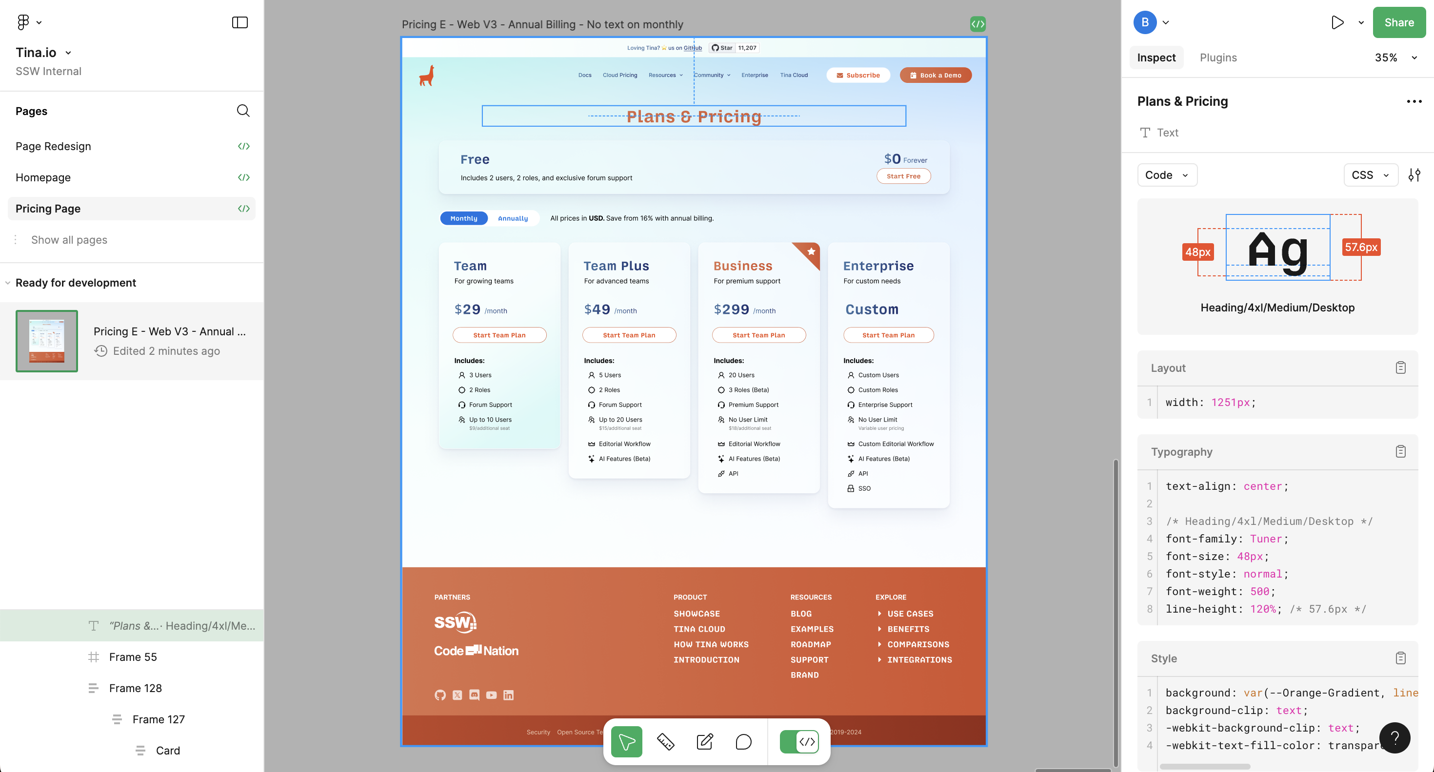
✅ Figure: Good Example - The design includes useful developer details such as color codes, font styles, measurements, and spacing.