Authentication - Do you have a 'Forgot your password' link?
Updated by . See history
Users often forget their passwords — the key to accessing their accounts. To handle this, include a "Forgot your password?" link on the sign-in page.
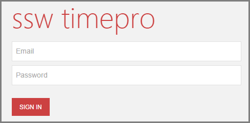
❌ Figure: Bad example - What will happen for the poor user that forgot their password?
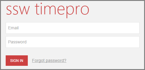
✅ Figure: Good example - Users have an option if they forget their password
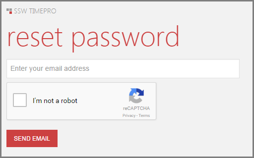
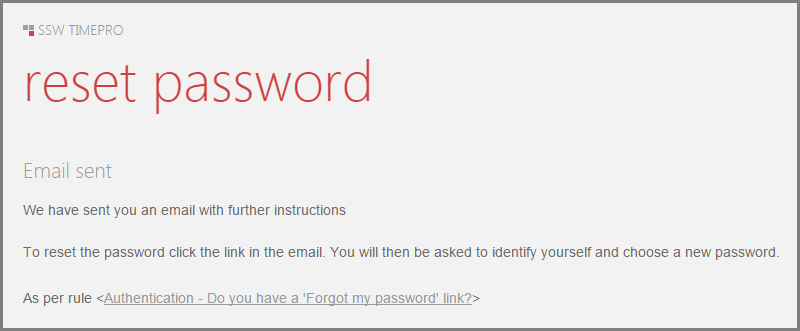
✅ Figure: Good example - Users enter their email to get a new password
Avoid extra wording
For best UX, “Forgot your password?” should usually be a single clickable link — the question itself is enough to imply “Click here to reset.”
Forgot your password? Click here to reset your password
❌ Figure: Bad example - Unnecessary text for a common action
✅ Figure: Good example - Short, clean, standard on most sites
Note: In UI text, use "your password" rather than "my password" to speak directly to the user.
Avoid username enumeration attacks
This practice also opens up the risk of "username enumeration" where an entire collection of usernames or email addresses can be validated for existence on the website simply by batching requests and looking at the responses.
Read more on Troy Hunt's blog post "Everything you ever wanted to know about building a secure password reset feature".
You should always aim to not disclose if a user is registered with your site or not.
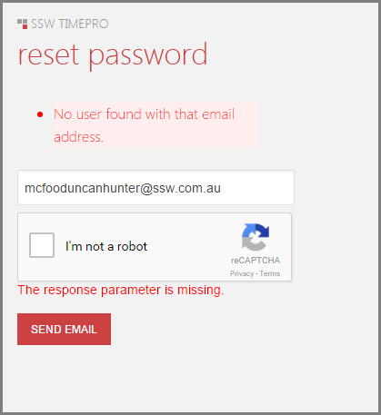
❌ Figure: Bad example - Displaying information whether a user exists or not
✅ Figure: Good example - Do not disclose whether a user is registered with your site
Acknowledgements


Need help?
SSW Consulting has over 30 years of experience developing awesome software solutions.